Farmers Market, Farmers Market Rebranding

Farmers Market, Farmers Market Rebranding
1/9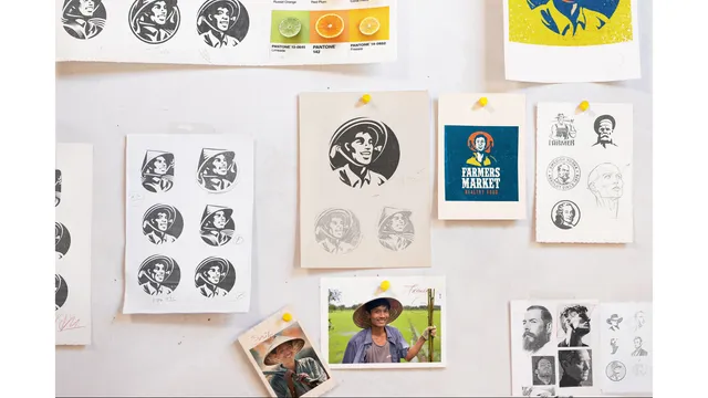





Re-design the mascott logo for Farmers Market, the new logo serves as a beacon of the brand's evolution, poised for future growth in the dynamic market of organic and natural foods in Vietnam.
Clients: Farmers Market
Sector: Food Retail
Published: 2022
Agency: Design Market
Overview
In 2020, Farmers Market, a leading retailer of healthy, organic food in Vietnam, decided to rebrand. The goal was to create a new logo that would appeal to a younger audience while keeping the essence of Vietnamese agricultural heritage.
Approach
The inclusion of a mascot became a focal point for the new logo. This mascot is a personified representation of a Vietnamese farmer, embodying the brand’s values and creating an approachable and friendly image that resonates with customers.
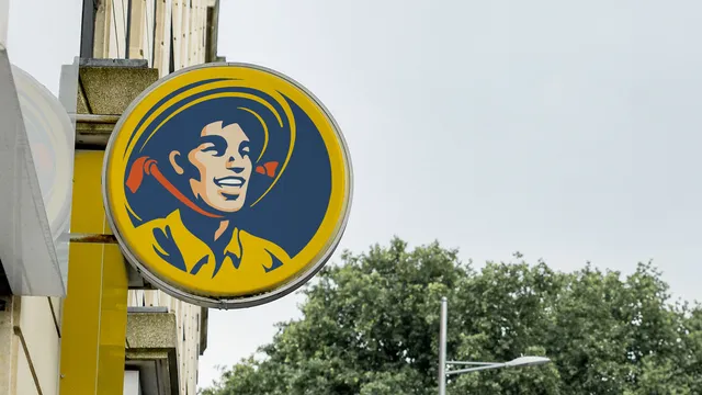
The new logo features a mascot: a smiling, friendly Vietnamese farmer. This character is designed to be approachable and energetic, wearing traditional farming clothes, including a conical hat (nón lá), to connect with the brand's roots.
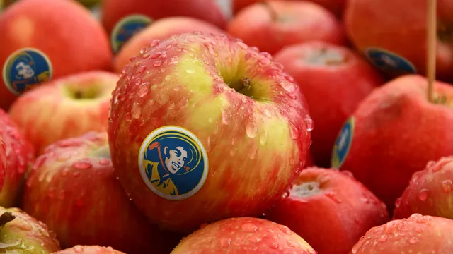
The color palette includes yellow, orange, and blue. Yellow adds a bright, cheerful touch, orange represents enthusiasm and creativity, and blue conveys trust and reliability. These colors make the logo vibrant and appealing.
Previous Version
New logo that would appeal to a younger audience while keeping the essence of Vietnamese agricultural heritage.
Conclusion
By rebranding with a focus on freshness, youthfulness, and cultural authenticity, Farmers Market successfully modernized its image, appealing to a broader and younger audience while staying true to its core values and heritage.
The new logo serves as a beacon of the brand's evolution, poised for future growth in the dynamic market of organic and natural foods in Vietnam.