The 31, The 31 – Brand Identity & Packaging Design
The 31, The 31 – Brand Identity & Packaging Design
1/17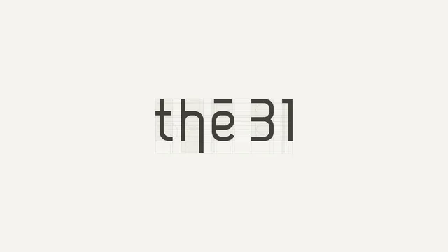
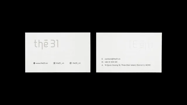
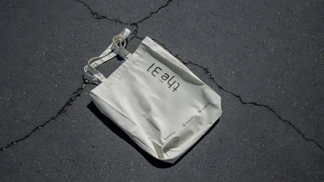

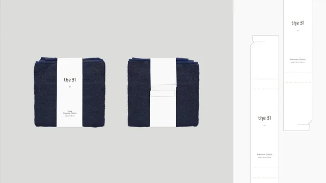
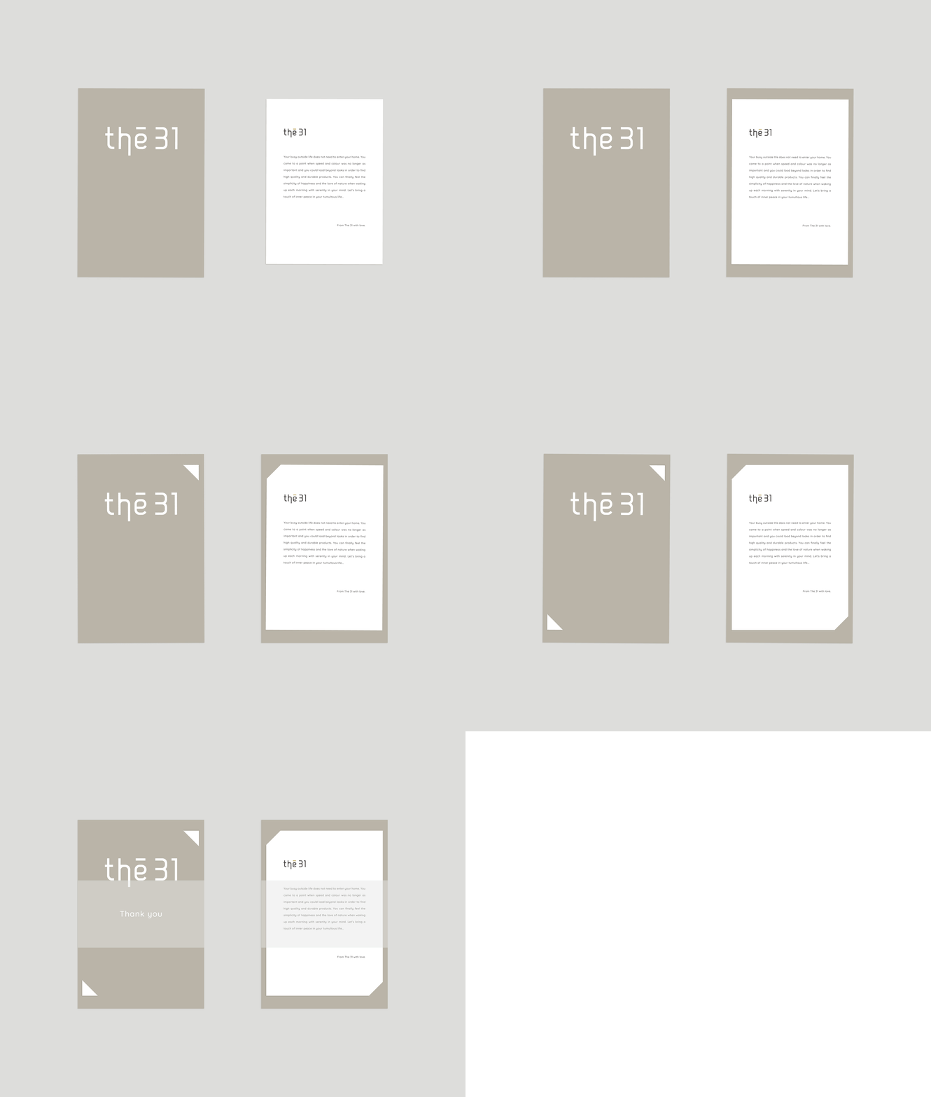
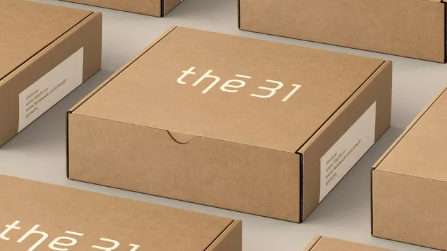
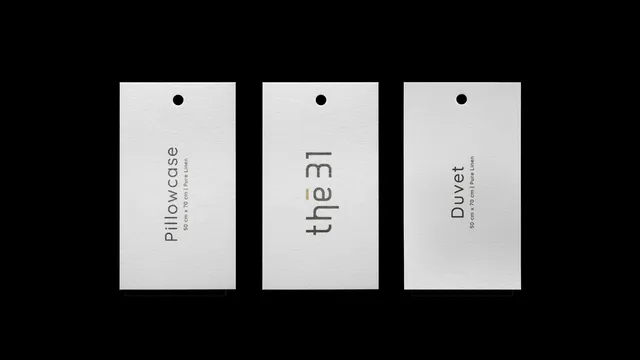
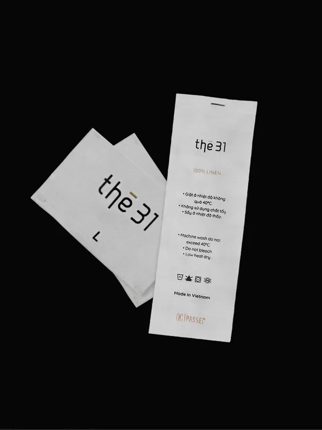
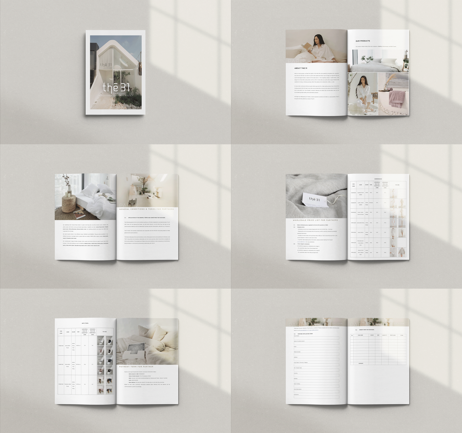


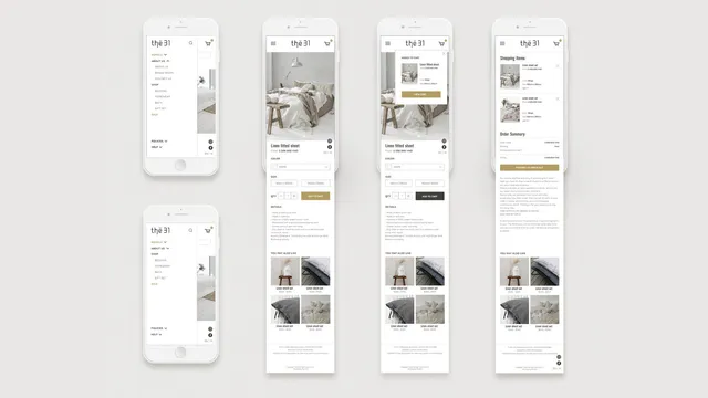
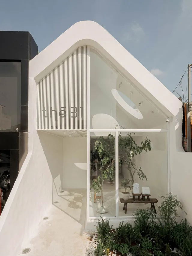
Brand identity for The 31, a visionary Vietnamese fashion brand embodying conscious living and sustainable fashion.
Clients: The 31
Sector: Commercial Fashion
Published: 2020
Overview
Understanding The 31
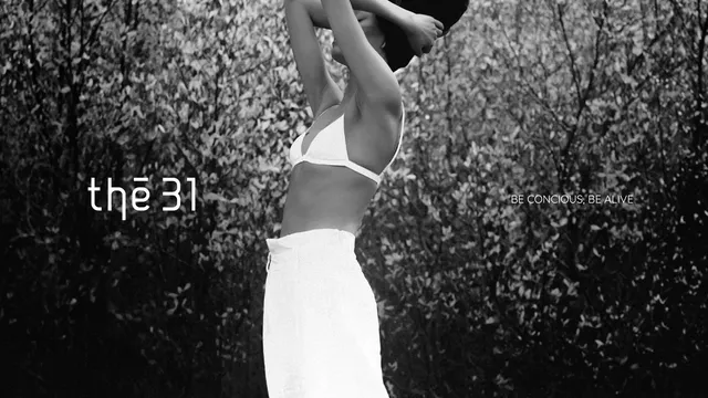
The 31 is inspired by the pivotal age of 31—a time when individuals typically seek greater calm, clarity, and sustainability in their lives. This insight informed every aspect of our design process, ensuring that the brand’s identity resonated with its core audience. The slogan, "Be Conscious, Be Alive," encapsulates this ethos, emphasizing the brand's commitment to mindfulness and vibrancy.
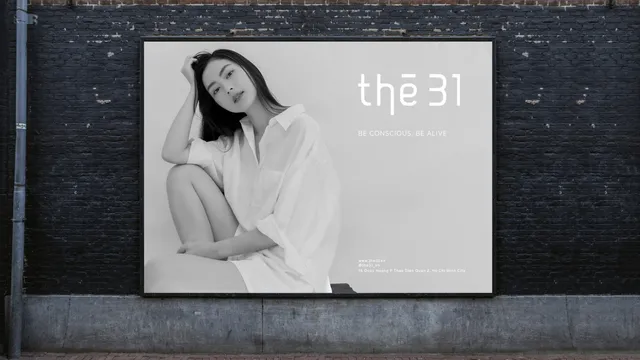
Our goal was to ensure that every touchpoint of The 31's brand experience reflects its core values of mindfulness, sustainability, and style. From the initial logo sketches to the final website design, every element was crafted with care and intention.
Approach
We designed a logo that combines elegance and simplicity.
Clean lines and minimalist design reflect the brand's focus on quality and sustainability, highlighting the brand's emphasis on balanced, conscious and sustainable living.
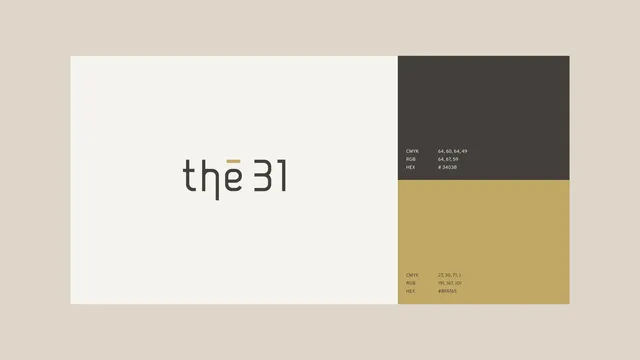
Color Pallete
We chose a calming and earthy color palette that reflects the brand's connection to nature and sustainability. Shades of beige and taupe bring a sense of tranquility and environmental consciousness.